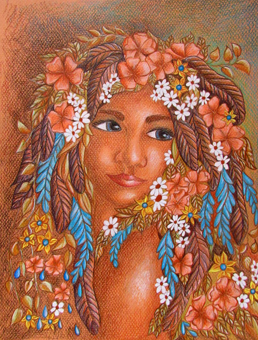
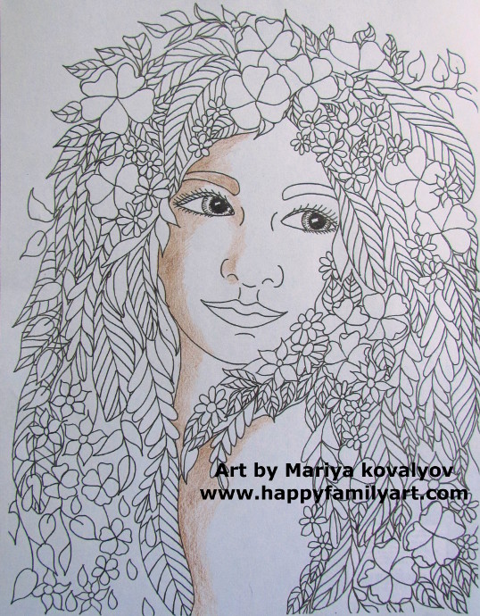
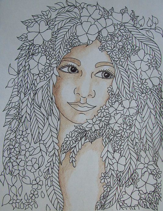
As I was working on my next coloring book, I made a page that I absolutely fell in love with. It is of a woman’s face framed in lots of flowers. Recently, I have had a few requests about doing a tutorial on coloring in a face in coloring pages. I decided that this will be a good tutorial to do with this particular page.
***This page contains affiliate links.***
This tutorial consists of two parts, because I did it on two different surfaces. The first surface is Canson Pastel Paper. I wanted the first one to feel more like an artwork, just because I liked the image so much. The second version is the original coloring pages, printed on a regular 8 1/2 by 11 piece of print paper and colored in. I like how both of them came out, and I hope you will too. I also really hope you will find it to be a helpful tutorial. Eventually this coloring page will be a part of a book (which will be called something along the lines of Finding Your Inner Goddess) and will be in our ETSY STORE.
I used my favorite Prismacolor Colored Pencils to color both of them. Although recently, I joined a few Coloring Art Groups online, and got so many wonderful recommendations. For one, I can’t wait to try doing some art with Gel Pens. Folks really enjoy using them for coloring, and I want to try it for a line art lesson on black paper with the kids, depending on how they work. Also, while I have been a Prismacolor girl for years, I would love to give the Derwent Colored Pencils a go. Plus, I also need to re-stock some colored pencils for the art class, so at the moment it’s a toss up between THIS ONE and THIS ONE. Alright, enough colored pencil talk, let’s talk about the project.
How To Color In A Face: Version 1
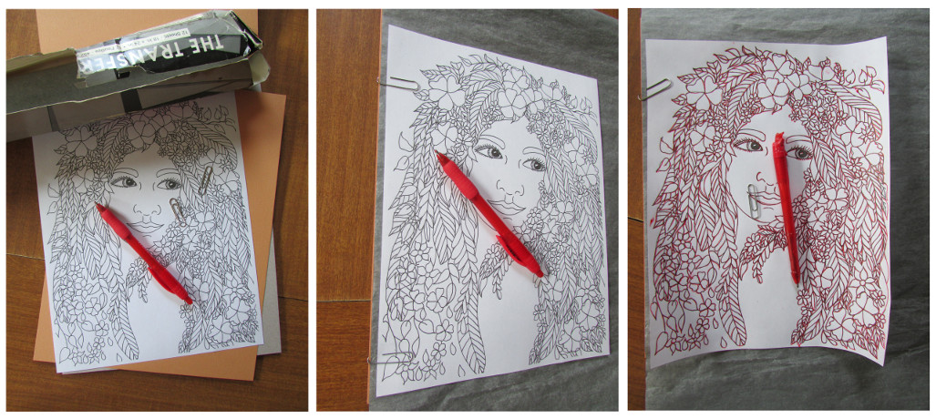
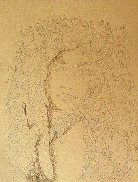
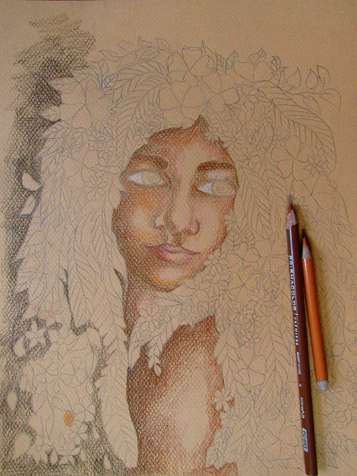
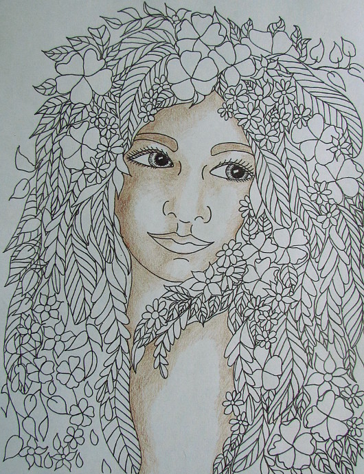
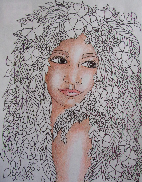
I am going to start with the one drawn on the pastel paper. It was a light brown/dark tan colored paper and slightly textured. The first thing I did was to take a copy of the coloring page, and use the artist transfer paper to transfer the image to the pastel paper. This is the graphite paper that I use, but I imagine any will work for this. I like to use a different color pen when transferring images, it helps me see what I already got and what I missed.
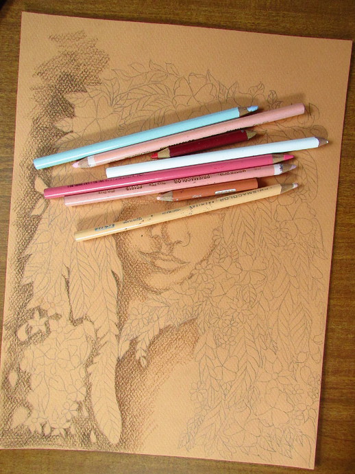
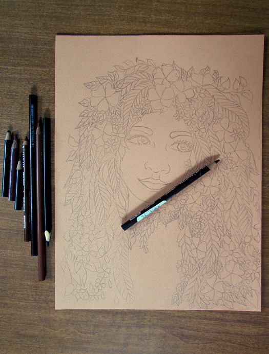
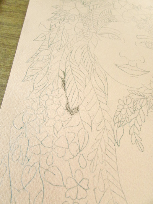
Once the image was transferred over I made a few corrections and touch ups and began coloring. Also, often I will lighten the transfer lines with a kneaded eraser just a bit. I almost always start with the darker colors: dark brown, black and indigo blue.
I started with the dark brown this time. Before drawing on the face, make sure to try each color somewhere else on the picture. Somewhere it won’t be a problem if you don’t like it. If no such spot exists in your drawing, have a scrap paper to try colors on. I used her hair, because ultimately, I would draw over it.
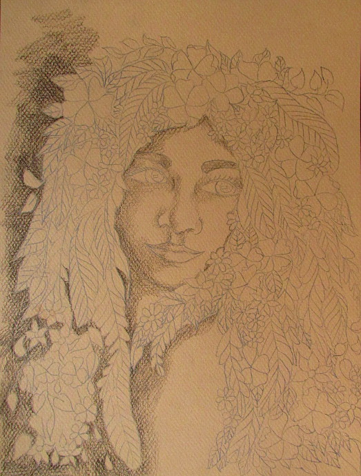
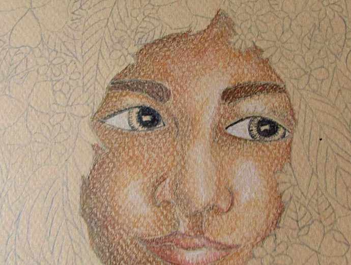
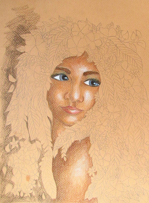
Decide where the light is coming from in your drawing (in mine it was from the right on the photo) and use the dark brown to shade just a little bit away from the light. Be careful to follow the approximate curves of the face. It doesn’t need to be perfect, it just needs to give you a starting point. On that note, nothing here has to be perfect, it just has to be satisfying and fun!
I continued to use dark brown to add more shade to the areas that are facing away from the light.
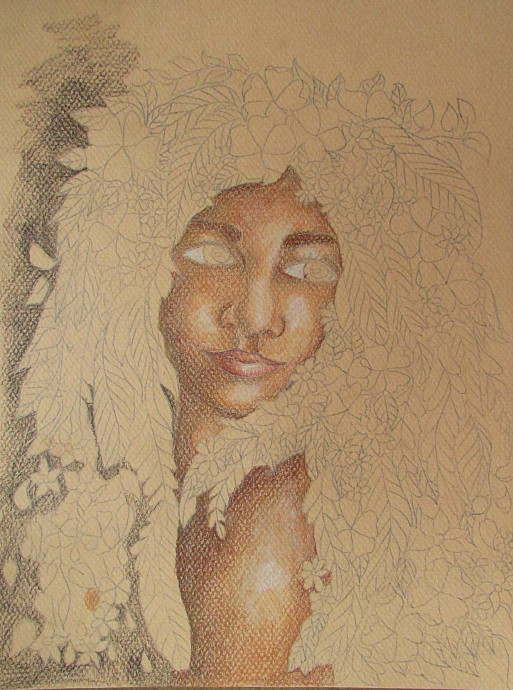
Another thing I like to do is while I use any color throughout the drawing, I use it a little bit on the back ground every time. This way the background starts to grow together with the drawing, and it always works with the colors in the drawing itself. As you see in the photo below, I started adding dark brown to the background as well. Keep the lips in mind as you work too. First color them with the skin tone, and then add a little bit of color. I find that if I just use reds or pinks, the lips always stand out way too much.
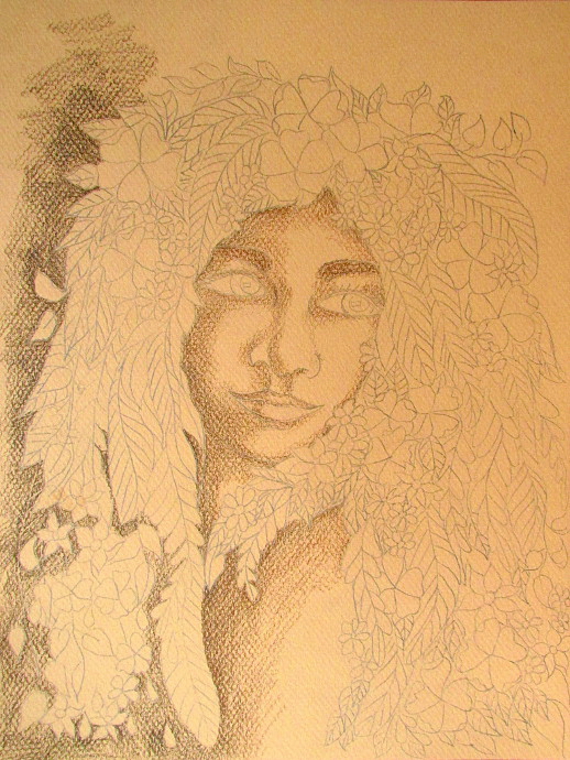
Set the dark brown aside, you will get back to it later. Next colors I am using is sienna brown and burnt ochre. I use them to build upon the dark brown shadows, add more to them, and shape the shadows a bit more. The trick is to go right over the darker tones with the lighter tone.
Now I add more pencils to my pile. These are the colors I have so far for the face: dark brown, sienna brown, burnt ochre, peach, black, cerulean blue, sky blue, mineral orange, crimson red, light peach, white and rose pink, and regular pink.
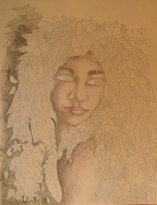
I add the whites to the eyes, and a bit of crimson red, to the lips.
Now back to my burnt ochre and mineral orange to add more tones to the face. Just following the guideline created by the darker colors earlier. Normally, I would include peach in a face tone, but it didn’t work well on this paper color, showing more pink. Instead I used peach to highlight the lips and a few highlights on the face later on. Slowly and gently build up color.
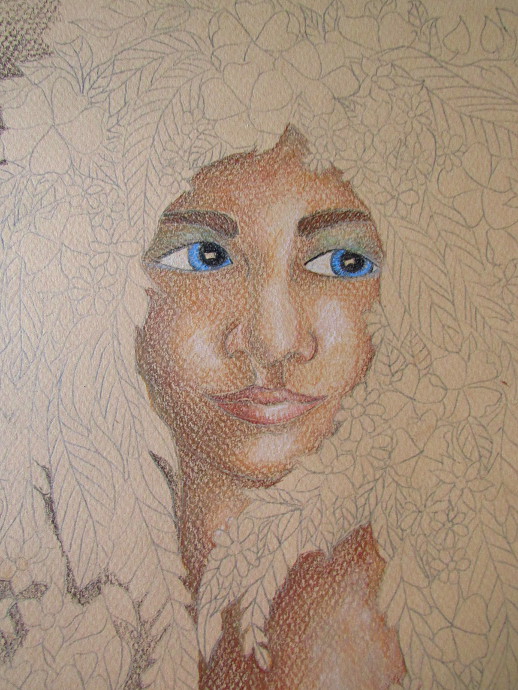
Using mineral orange, peach, light peach and sienna brown, I work the shapes of the face until I am happy. I added some white and light peach to the areas that are highlighted: the cheek, chin, nose, shoulder.
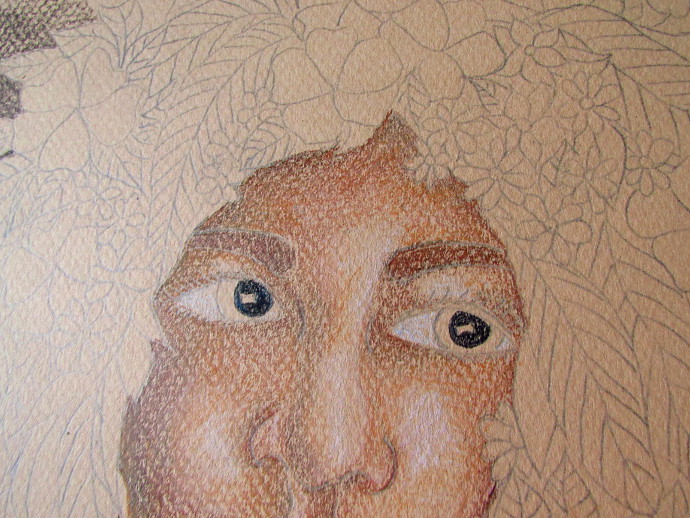
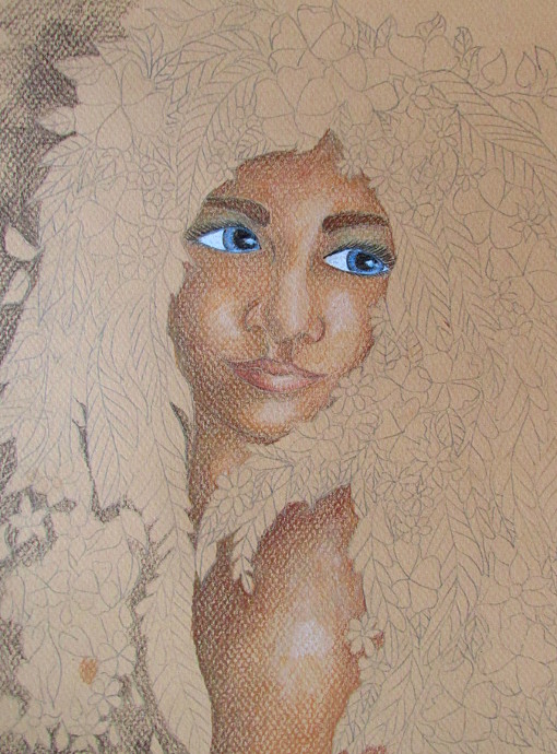
Time to work on the eyes, because eyes will bring the whole thing to life! Also, I usually focus on the eyes half way through doing the face. This way, I go back to the face once the eyelashes and the entire eye is in place and I can work around them. I started with black for pupils. leaving a little spot for the reflection (which was a mistake that I had to fix later).
A bit of black outline for the eyelid and the iris.
I added small lines inside the iris using a black pencil.
Decide on the eye color. I am going with blue, using a cerulean blue pencil. I also added a bit of the cerulean blue and the sky blue between the eyebrow and the eye lid, and a bit underneath the eye.
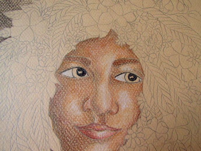
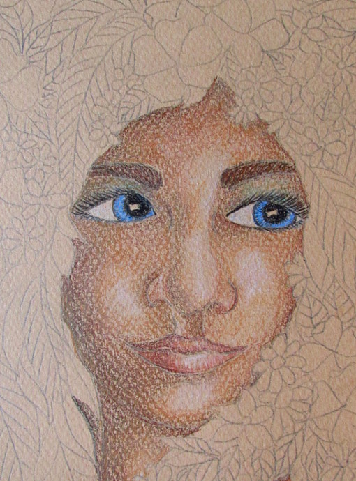
Use a well sharpened black pencil to do the eyelashes.
Here is where I had to fix that little bit of light area I left in the pupil. I colored it black, and then used a Faber-Castel eraser pencil to create it in a different spot.
Use a well sharpened white to make the highlight.
Now I am back to the face: touching up, adding more highlights and shadows. I also added a touch of brown in the iris to make it more interesting.
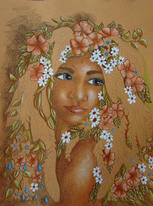
Once the face is all finished I am onto the hair. I want to stick to a very similar color palette through out, so browns, white, a bit of blue. The few new colors I introduce is a touch of green (lime peel, goldenrod, olive green, grass green, and dark green) and some yellow. Almost every tidbit and flower has brown in it, or some brown under the final colors.
I keep working on the hair and the background simultaneously, and I am back at it with the dark brown, the sienna brown, and the burnt ochre.
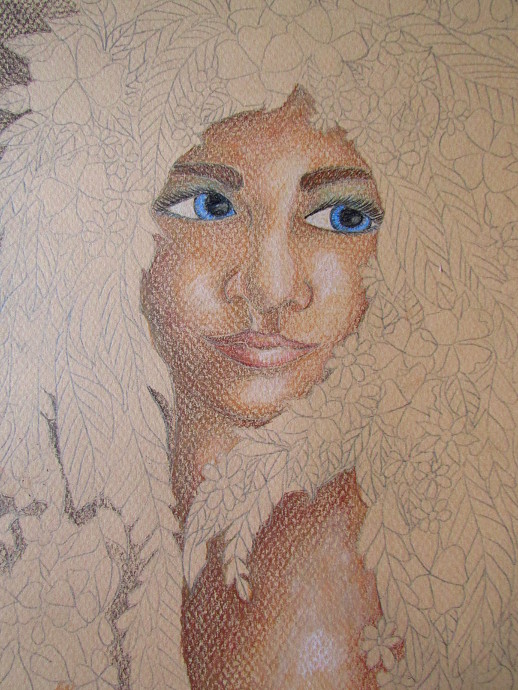
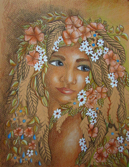
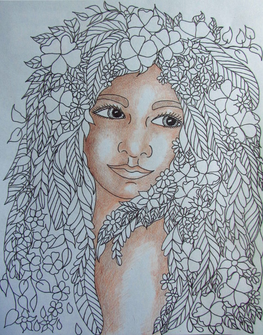
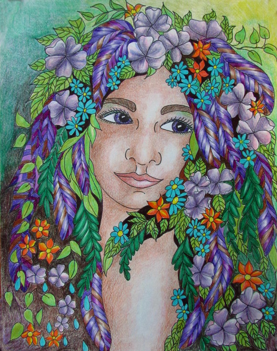
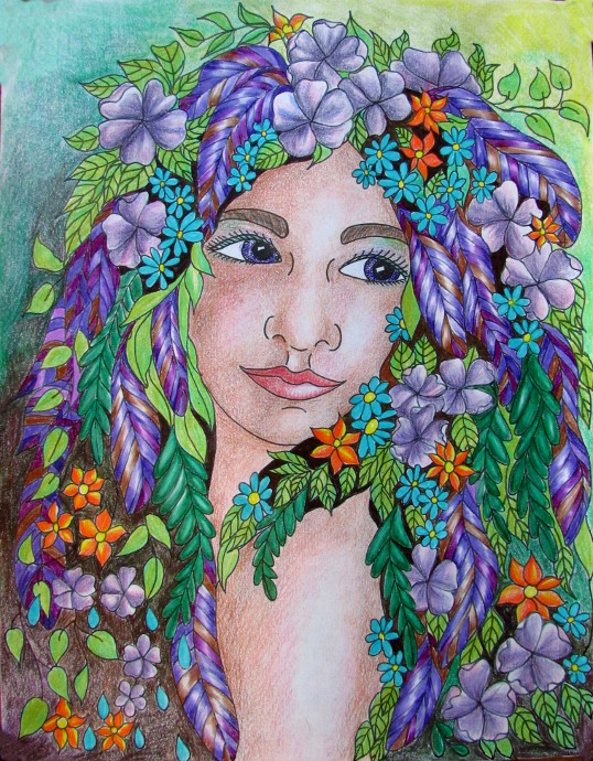
Here is the finished drawing. I had a difficult time photographing it in the right light. Of course, each room I go to has a slightly different tint. I think this one is the closest to what it looks like.
Here are the other two photographs of the final version in a different light, just in case.
How To Color In A Face: Version 2
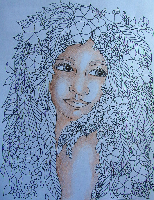
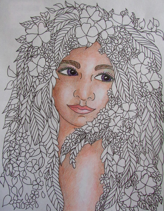
This is the original coloring page, printed on a regular piece of printer paper and colored in in colored pencils.
Just like in the other one I started with the shadows, using dark brown.
Keep working in the darker color to build up the shadows.
Add a lighter color (such as sienna brown or burnt ochre) right over the dark brown.
Now that I am working on plain white paper, I use peach, light peach and light pink to further shade in the face.
I just keep gently building up color: from the darker to the lighter. I keep going over the darker colors with the lighter ones to blend them all together.
It is time to add some pinks and reds to the lip. The upper lip is usually a bit darker then the lower lip.
It is time to add color to the iris, I am going with purple for this one. Plus a bit of color to the eye lid. Also, even though the paper is white, I use a white pencil to go over the lightest parts of the face. It makes it all look a bit smoother.
Color in the flowers. Use white for the highlights. Same as in the previous picture. I stick to the same color combination: purple, blue and green, and work on the background at the same.
After I finished the flowers I felt that the face seemed too pale against all the colors, so I added more pink, red and dark brown to the face.
All done!
