Acrylic Paintings
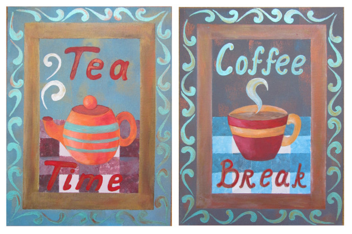
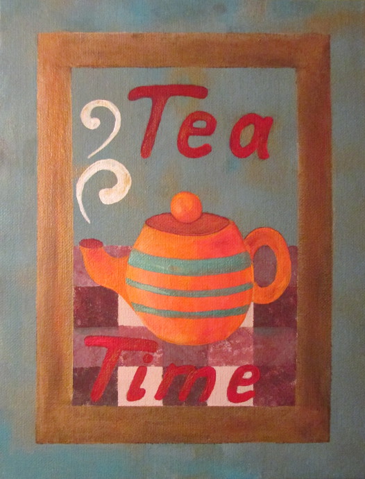
“Coffee Break” and “Tea Time”
Coffee House Posters
A while back I used to work in a family coffee place. I made a bunch of paintings to hang in the windows. I really enjoyed making them. They were fun, simple, and a pleasure to paint. Everyone that saw them enjoyed them as well. I decided to make a few to hang in the kitchen, sell, and give as gifts. Here are the step by step instructions for them so that you can make them as well!
For this coffee and tea acrylic painting you will need is a canvas board (I used 9×12 inches this time, but any size you like is great), and acrylic paints. The colors are up to you, however since I was doing two posters at the same time, I made sure to use the same color palettes on them. This way they go well together when hanging side by side.
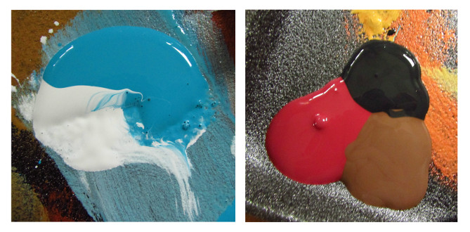
As I mentioned, I kept the colors similar for both, so here are my basic colors. I started by choosing the backgrounds. Nothing too light. I used a combo of turquoise, gold and white for the Tea Time, and brown, black, red, turquoise, copper for the Coffee Break. Don’t mix the paints, just let them sit side by side.
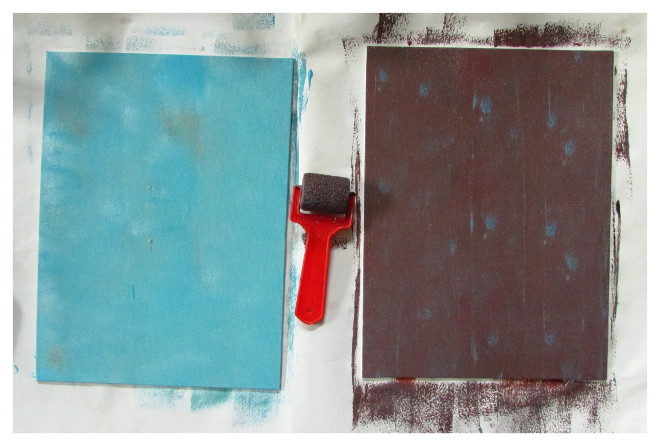
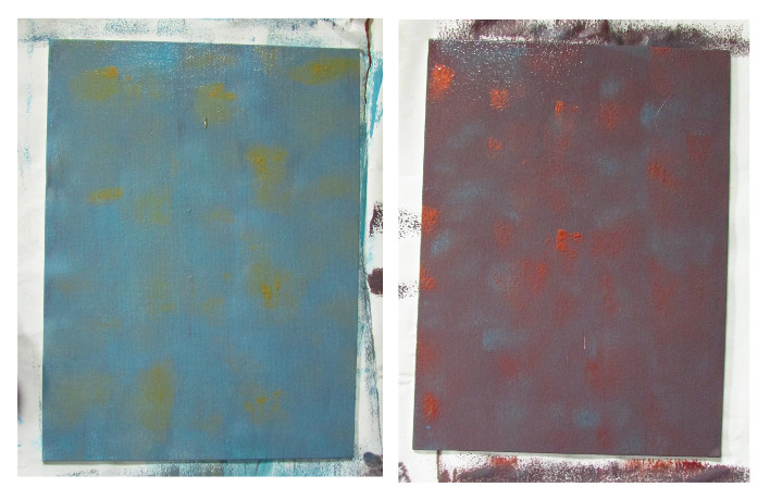
I started out by using a small roller and just rolling some of the background colors on the canvases. No roller? Paintbrush works just as well. I liked the repetitive spots of color that the roller left. I applied two coats. First was more even, and the second one I made sure there are plenty of those repetitive spots of color that I liked so much.
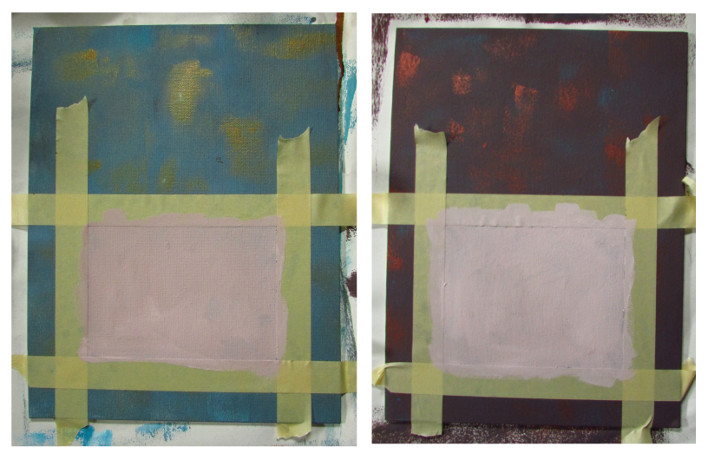
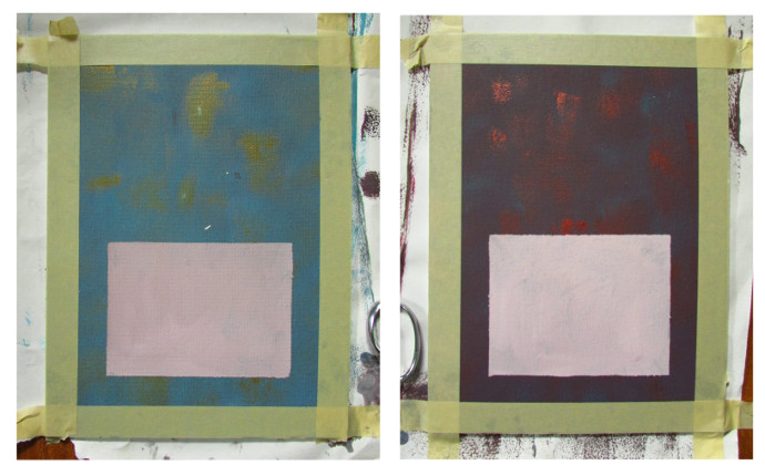
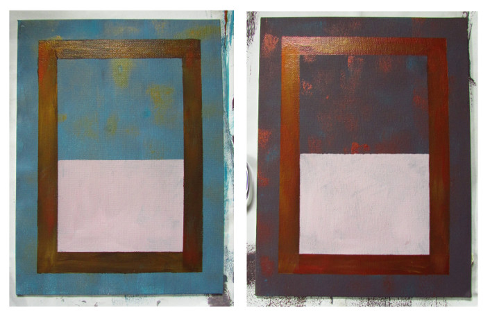
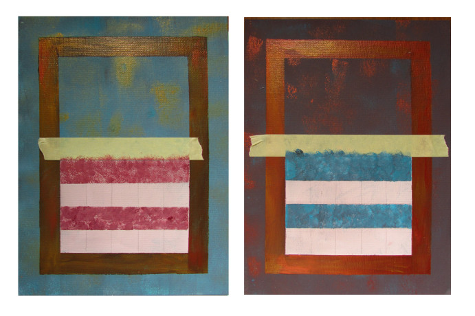
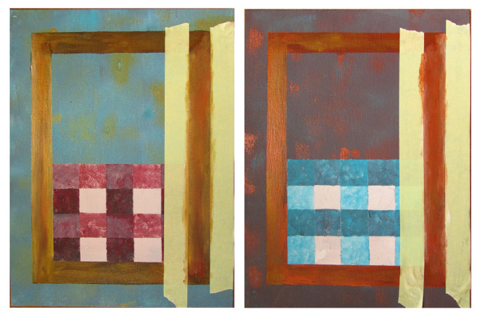
After I let the background dry for a bit, I used masking tape to separate the center. That is where the table for the cup will be. Just look at the photo below. I used a paintbrush to paint in the center. I picked a mix of white and brown/red for it. I allowed it to dry and then peeled off the tape.
After I finished the center, I carefully blocked off about an inch from the edge. See that space between the center and the tape. That will be the frame.
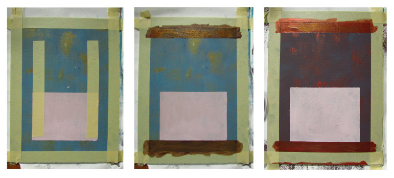
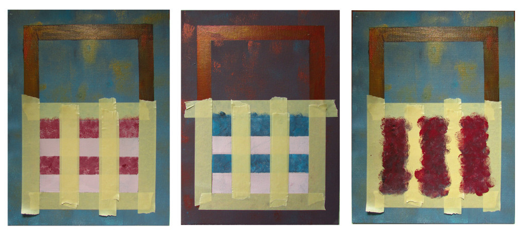
Here is where I started to paint the frame. However, somehow I messed up with taking pictures, so let me explain it first. You see the left most photo. That is how the tape should be applied, EXCEPT instead of putting it on vertically as in the left most photo, put it on horizontally, and reaching from one edge of the canvas to another. Once you peel the tape off, you should have the top and bottom lengths of the frame done. Look at the two pictures on the right to see what I mean. For frame colors I wanted metallic, so it is brown and gold for Tea Time, and copper and red for Coffee Break.
Also worth a note, at a later point I decided that I need to lighten the color of the frames a bit in order to make them stand out more against the background. Something to think about as you are choosing the color for your frames.
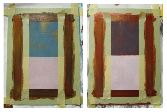
Here I waited for the top and bottom frame sides to dry. Applied more masking tape, but this time going vertically, and painted in the left and right sides of the frame.
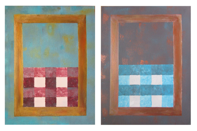
Once it dries a bit, and you take the tape off, this is what you will see.
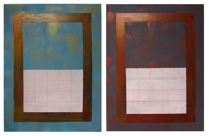
Next I took a ruler and made some checkers lightly using a pencil. There were a few times that I had to erase the lines to make the spaces more even. It probably would’ve been easier to measure it first, but I can be very lazy at times, so I just eyeballed it. I suppose you could just start with masking tape to tape off the checkers, and forgo the pencil altogether.
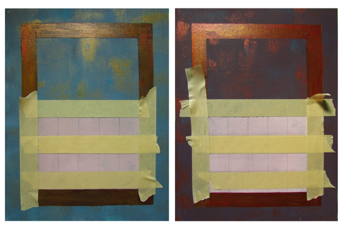
Here I used the masking tape yet again. I blocked off the parts that surround the center, and then I blocked off the two alternating lines, leaving the top and the third from the top line to be painted.
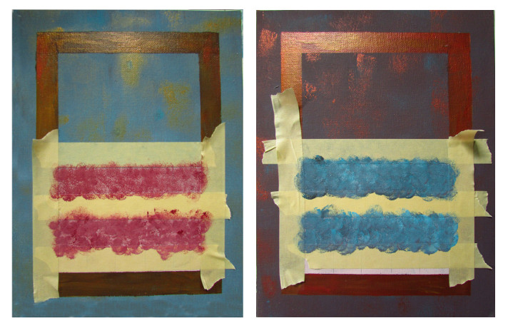
 Using a small stamp sponge that I found in the kids art supply drawer, I stamped the two open table lines. Red and white for the Tea Time, and blue, white and brown for the Coffee Break.
After the paint dries a bit, peel off all the tape except the top most strip and the vertical strips that are protecting the frame.
In the picture below I took off all but the top most strip just so that it can be seen what it looks like under all that tape. I reattached the tape after I took the photo.
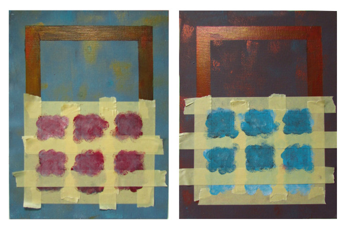
This time add the tape going from top to bottom. I blocked off the second and fourth vertical strips, as well as protected the bottom piece of the frame. These strips are wider, so they needed two pieces of tape to get them blocked. Then I chose the color that was a bit darker than the one for the horizontal strips. Darker red (with more black and brown) for the Tea Time, and a darker blue (with more black and brown) for the Coffee Break.
Using the same sponge stamp I painted them both in.
After the paint has dried. Without removing any of the tape already on there. I blocked off the horizontal strips 2 and 4 again, and added some of the lighter, but not quite as light as the first time around, color.
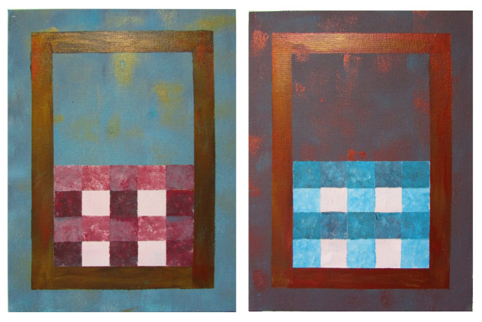
After everything is dry, remove the tape, and taa daa… This is what you should see.
Remember earlier I mentioned that I decided to make the frame a bit lighter to make it stand out more. Well, here it is. I had to tape off each side of the frame separately (I reused the same two pieces of tape over and over again), and then I added some white, gold, beige to the mix that was already there. It made it a little lighter, and I was happier with the way it looked. To save yourself the trouble though, just consider the amount of contrast you want ahead of time!
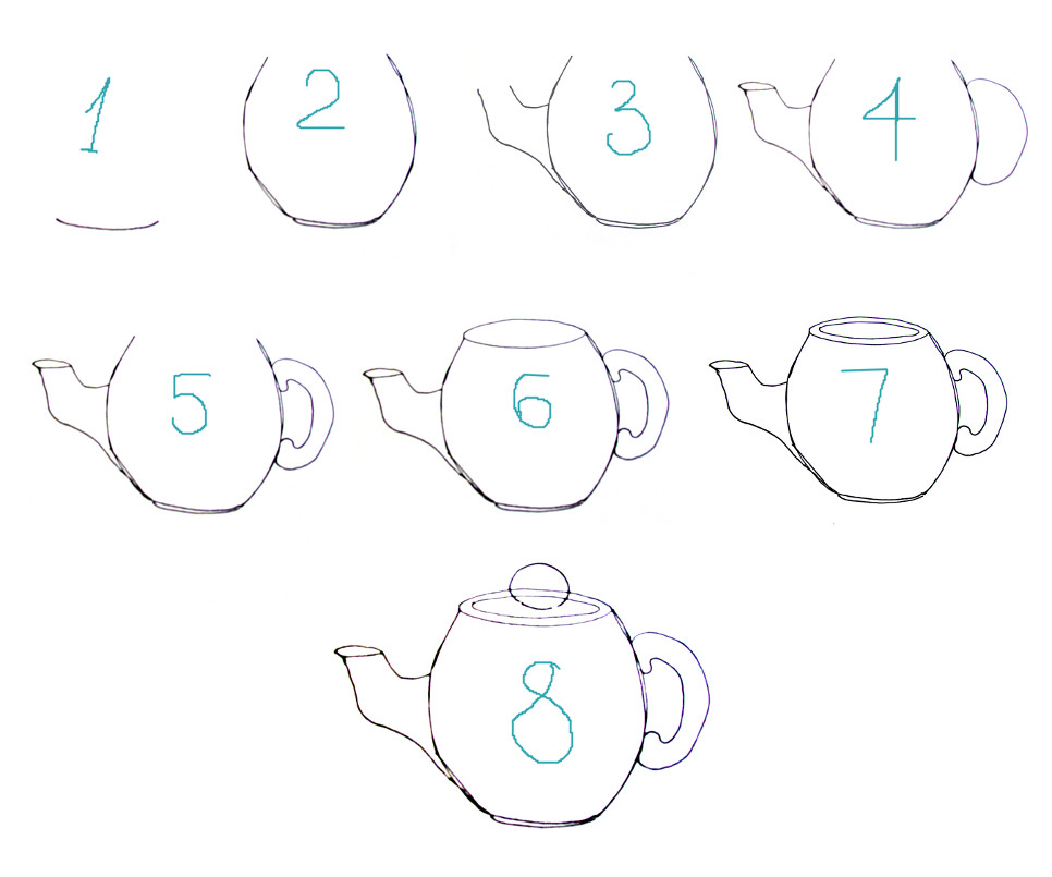
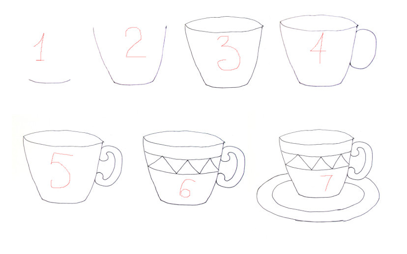
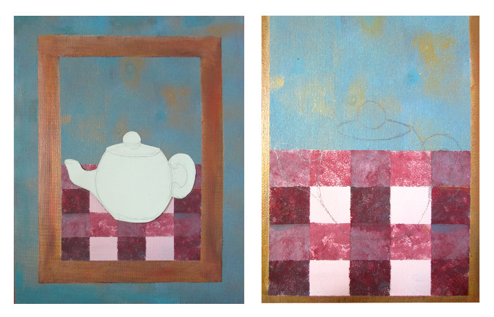
Next it is time to draw the tea pot on the Tea Time poster, and the coffee cup on the Coffee Break poster. Below are quick and simple instructions for drawing them. There are done quickly just to give an idea.
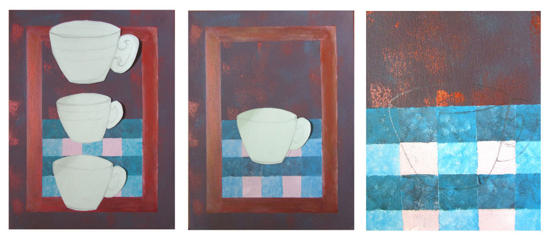
For both posters I first sketched the coffee cup and tea pot on some scrap paper. I cut them out and placed them on the poster, to see if I am happy with the size. The first cup was way too big, the second was too little, and the third just right. I am glad I did it, as it saved me quite a bit of mess and erasing.
After I picked the right size, I was able to just trace it on the canvas.
I did the same with the tea pot.
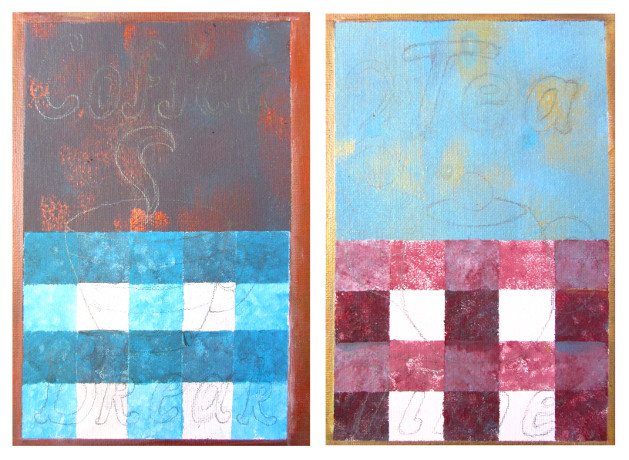
Now come the letters. There are many ways you can do them. You can get a lovely stencil in a store, or you could make your own by printing the words in a desired font and size. I am lazy, so I just write them neatly and then make them thicker by tracing around what I wrote.
I took a photo, and my letters are somewhat visible oh here.
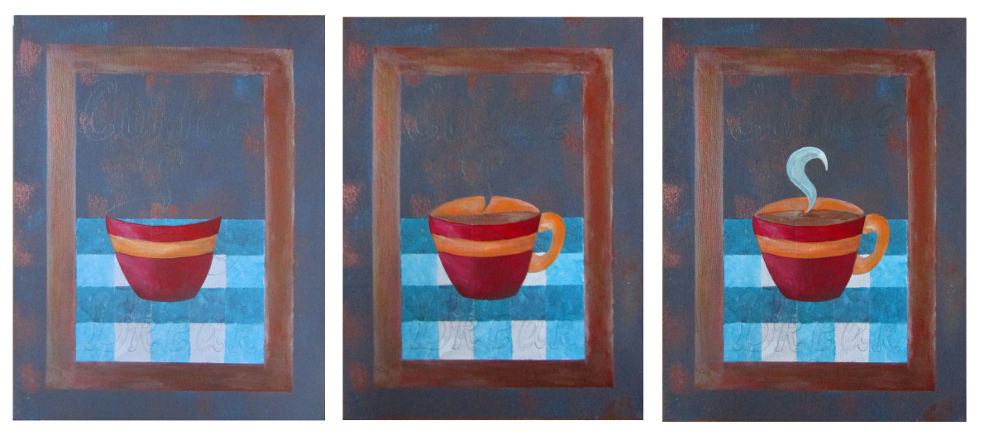
It is time to start painting. I started with the Coffee Break. First, I did the cup. I made the right side a bit darker, and the left has a bit more white, then I did the inside of the cup with some coffee in it, and don’t forget a little steam coming off the cup.
 The letters are next. I used turquoise and red, and added gold highlights to everything. Above is a detail from the letters.
After you’re done, it would look somewhat like the picture below.
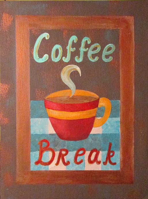
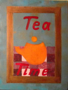 Do the same with the Tea Time poster.
I painted the stripes on the teapot after the orange paint has dried a bit. I found some awesome metallic turquoise paint in the kids’ art supply box and thought it would add a nice touch of something shiny.
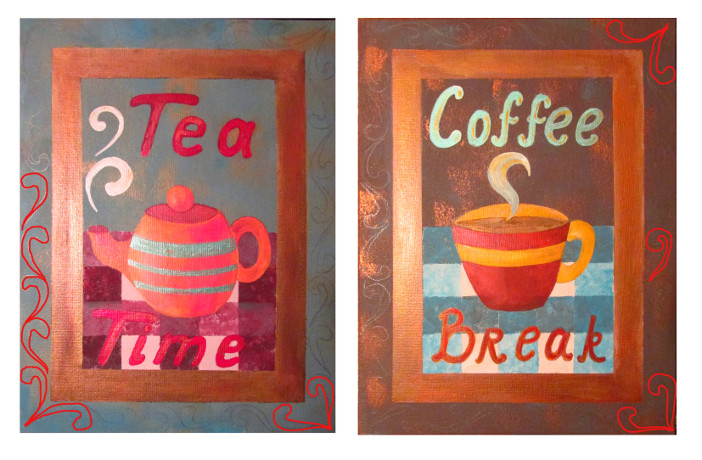
After I was done painting the coffee cup and the tea pot and all the words I still felt like it needed more. I decided to add some squiggly designs along the edge. I drew them on lightly with the pencil, and traced the red on my computer so it is a bit easier to see. They go all around the edge.
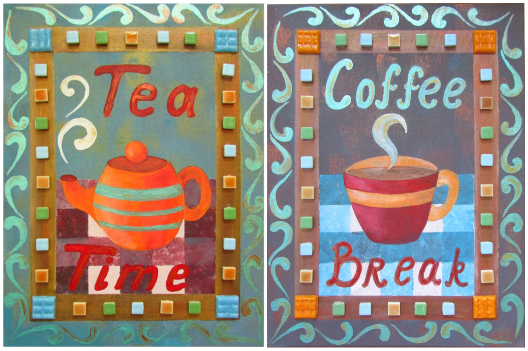
That wonderful turquoise metallic paint, with copper highlights for the Tea Time, and gold highlights for the Coffee Break, made these paintings look lovely.
After, because I just can’t let things be, I added a few mosaic pieces on the frame using white glue. All done!!!
